Recent Posts

Character Building
Tony-nominated actors perform scenes from their shows out of costume but in character.
Backstage at the First Fashion Week Show
Experience the frenzy and interconnectivity of backstage at the first show at Lincoln...
A Financial House Advantage
An animated explanation of how banks use securities lending to make a profit, while...
Chasing a Police Scanner
Reporter Corey Kilgannon, Marcus Yam and myself chased calls over a police scanner...
Music Videos for The New York Times Magazine
Eli "Paperboy" Reed performs the title track from his new album and a proof of concept...
Popular Posts
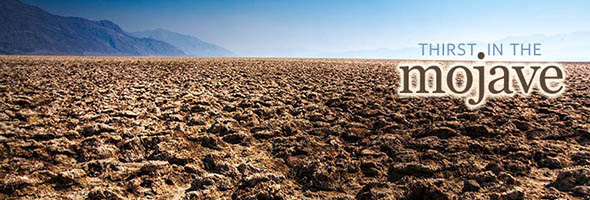
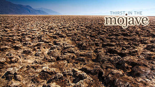
Thirst in the Mojave
Posted by: Zach Wise
Tags:
Documentary, Films, Films, Documentary, Video, Flash, Interactive, Las Vegas Sun, Maps
Posted date:
January 5, 2009 |
34 Comments
The Thirst in the Mojave piece is my attempt at making video interactive and contextualizing its content. Video on the web is great but it lacks many web-centric features or enhancements.
The advantage of web video over traditional video has typically revolved around the ability to share with friends and time-shift watching content. Thirst in the Mojave tries to bring a little more web mentality to video but still utilize the linear narrative strengths that make video such a great storytelling tool.
I completed the project before I left the Las Vegas Sun back in August and for reasons I’m not sure of, it finally launched.
Features of Mojave

Interactive geo-coded video
Each scene in the story is geo-located to where it was shot or what you are seeing. A GPS data-logger was used on every shoot for the project and GPS coordinates were logged for each shot and photograph made.
Lower-Third Bios
Every “lower-third” for the people speaking is brought in using flash and allows you to always know who is currently speaking. If you click on the name of the person, you can see a short bio including information relevant to what they are speaking about. The idea here was to contextualize or qualify their voice of authority.
More Info!
The more info box is triggered by the video playing to bring up context specific data, facts, graphics, links or videos. This is a great way to provide content that is informative and relevant but could slow down the main narrative.
Transparency is a great tool of truth.

Another use of the more info box in this project was transparency. An example of this is a scene in part 3 where Pat Mulroy is talking about the pipeline project on Face to Face with Jon Ralston. In the narrative you see several clips from the program but in the more info box you can watch the entire Face to Face show that those clips came from. Any viewers who might be skeptical that those clips were taken out of context can watch the program and see that the clips were selected appropriately.
All together, about 20 hours of footage were shot and edited down to 22 minutes for the main narrative.
The main narrative video content is divided into 5 parts for the web. The piece was also edited for TV by cutting it into 4 parts for commercial breaks with a total run time of 22 minutes.
60 minutes of extra footage

I can’t tell you how many times I’ve edited an interview and had to lop off some really interesting information because it strayed from or didn’t fit the tight narrative I was working on. Now the viewer is in control and can let their curiosity of a subject drive them to discover more on their own. Facts spoken in the video can have links citing sources, or where to go for more info.
Curiosity

There is also approximately another 60 minutes of extra footage that shows up in the more info box during the piece. Dozens of infographics were created for the piece. Between the geocoded map items, info box extras and bios there are about 145 extra pieces of information shown.
Interactive Water Use Map

We thought this topic was strong enough to go even further. We built a database of water usage from public water records for over 1/2 a million single family homes in the valley. We then built a “water use app” to allows viewers to search a map of the Las Vegas Valley to find out how much water they’ve used in the last year. They can then compare their usage to their neighbors. On top of the search functionality we also visualized water usage density and swimming pool density on the map. Approximately 70% of the water problem falls on outdoor residential water use, I think this app is a real asset towards understanding that problem and hopefully doing something about it.
About the author

Zach Wise is an award-winning former Senior Multimedia Producer for The New York Times and Associate Professor at Northwestern University.
Related Posts

Backstage at the First Fashion Week Show
Experience the frenzy and interconnectivity of backstage at the first show at Lincoln Center during New York Fashion Week.

Chasing a Police Scanner
Reporter Corey Kilgannon, Marcus Yam and myself chased calls over a police scanner for around 16hrs straight. What we found wasn’t what we expected.

Shaking It to New Orleans Bounce
Bounce is a raunchy, local hip-hop style that developed in the 1990s but is only now escaping its hometown with the help of some unlikely stars.
-
http://twitter.com/zlwise/statuses/1171931314 zlwise (Zach Wise)
-
http://twitter.com/andrewzahler/statuses/1098795008 andrewzahler (Andrew Zahler)
-
http://twitter.com/gmarkham/statuses/1098786715 gmarkham (gmarkham)
-
http://twitter.com/Journerdism/statuses/1098765979 Journerdism (Will Sullivan)
-
http://twitter.com/eyeseast/statuses/1098196088 eyeseast (Chris Amico)
-
http://twitter.com/zlwise/statuses/1097930350 zlwise (Zach Wise)
-
http://twitter.com/dnolan/statuses/1097964096 dnolan (David Nolan)
-
http://twitter.com/derekcasanovas/statuses/1204801314 derekcasanovas (derekcasanovas)
-
http://twitter.com/wblau/statuses/1103218735 wblau (Wolfgang Blau)
-
http://twitter.com/wblau/statuses/1103218551 wblau (Wolfgang Blau)
-
http://twitter.com/wblau/statuses/1103217290 wblau (Wolfgang Blau)
-
http://twitter.com/tboemily/statuses/1099825347 tboemily (Emily Seawell)
-
http://twitter.com/SamAbernethy/statuses/1098809403 SamAbernethy (Samantha)
-
http://twitter.com/andrewzahler/statuses/1098795008 andrewzahler (Andrew Zahler)
-
http://twitter.com/gmarkham/statuses/1098786715 gmarkham (gmarkham)
-
http://twitter.com/Journerdism/statuses/1098765979 Journerdism (Will Sullivan)
-
http://twitter.com/eyeseast/statuses/1098196088 eyeseast (Chris Amico)
-
http://twitter.com/zlwise/statuses/1097930350 zlwise (Zach Wise)
-
http://twitter.com/dnolan/statuses/1097964096 dnolan (David Nolan)
-
http://www.tamark.ca/students/2009/01/06/tuesday-squibs-98/ Notes from a Teacher – Tuesday squibs
-
http://collegewebguy.com Drew
-
peter
-
Darren
-
http://digitalartwork.net Zach Wise
-
http://thecompellingimage.wordpress.com/2009/04/02/a-video-is-worth-1000-layers/ A Video Is Worth 1,000 Layers « The Compelling Image
-
http://eileenmignoni.com Eileen
-
http://raisac.wordpress.com/2009/12/01/scarcity-of-water-in-las-vegas-interactive-video/ Scarcity of water in Las Vegas interactive video « Raisa's converged blog
-
http://niemanstoryboard.us/2010/02/26/frontline-and-the-international-center-of-photography-look-at-news-narratives-for-a-digital-era/ Frontline and the International Center of Photography look at news narratives for a digital era – Nieman Storyboard – A project of the Nieman Foundation for Journalism at Harvard